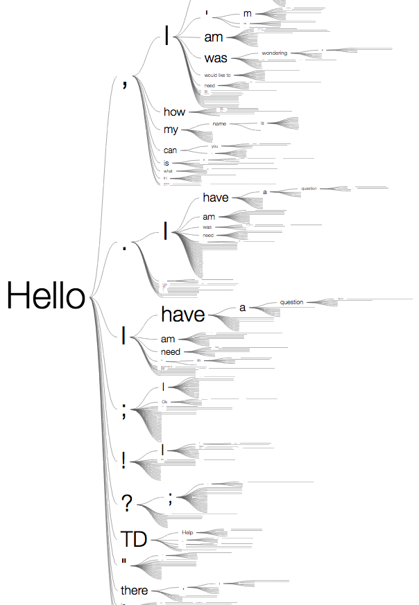
This is a visualization of TD Bank customer service chat conversations that begin with the word, "Hello".
Senior Manager, Data Visualization Lab
I spent two years leading the data visualization efforts for an advanced analytics team at TD Bank. After completing my PhD, I was recruited to build a data visualization lab, a 4-person team dedicated to innovation and data storytelling. I worked closely with data scientists and business analysts to build dashboards, webapps and short videos for visualizing machine learning model performance and other bank related issues.
Awards
"Grand Champion", 2017 Think Digital Tech Jam
Best In Show", 2017 Marketing Analytics Solutions Fair
Team of Distinction", 2017 TD's Got Talent Award
Modelpedia
The data scientists I supported were responsible for all the machine learning models used to generate marketing campaign lists, next best action engines, up-sell recommendations, and various other use cases. Before I joined, all information about these models was stored in an Excel document. They were constantly fielding questions from stakeholders about model performance and other details. We decided to build a web app called Modelpedia to democratize this information. We published it on an internal web server and everyone was thrilled. The project won the “Best in Show” award at the 2017 Marketing Analytics Solutions Fair, a science-fair like event for fintech innovators with roughly 30 entries.
Income Volatility Study
With access to the income and spending data of nearly one third of all Canadians, we had the opportunity to explore the financial profiles of many different segments of the population. For this income volatility study, in collaboration with Ipsos, I designed and programmed a small web app that visualizes the flow of funds for people with especially volatile incomes. I used a Sankey-like diagram, built from scratch with P5.js, to indicate different income sources, spending and saving patterns for different customer segments.
Marketing Message Audience Size Estimator
The marketing planning team requested a tool for estimating the number of customers different kinds of marketing messages will resonate with across six demographic segments. This simple web app uses data from various sources to calculate the potential "bang for your marketing buck" and visualize the results.
The sliders on the left represent marketing message themes such as “focused & disciplined”, “trusts institutions”, “risk averse”, etc. By scoring a message according to the themes it evokes using the sliders (e.g., “It’s never too late to start saving for your retirement.”), it is possible to quickly estimate the number of people who will respond positively to that message.
Canada Cartogram
TD has more than a thousand branches across Canada. Most of them are clustered within cities that are spread apart from each other, geographically speaking. This makes it difficult to create an overview map to compare branch performance across the whole country in a single view. The branches that are close to each other overlap and become indistinguishable. And there is a lot of wasted screen real estate in the lower populated regions. My team developed a cartogram algorithm to draw a map of all the branches that preserves the geographical relationships while still making each branch visible. We then built a Tableau app using this new layout to explore which branches are most effective at following up on sales leads. With this new layout, it is much easier to identify the high performers and compare them to their neighboring branches.
Floor map redesign
The map near the elevator of all the conference rooms on the floor was an information design nightmare. People would stand in front of it for a long time trying to get their bearings and then invariably ask for help. It went against everything I stood for so I decided to redesign it. My version reduced the amount of time it took to find a meeting room by 75% and also served as a nice calling card for my team’s services.