Topo-phylogeny
A new way of displaying hierarchical biological data, inspired by topographic maps.
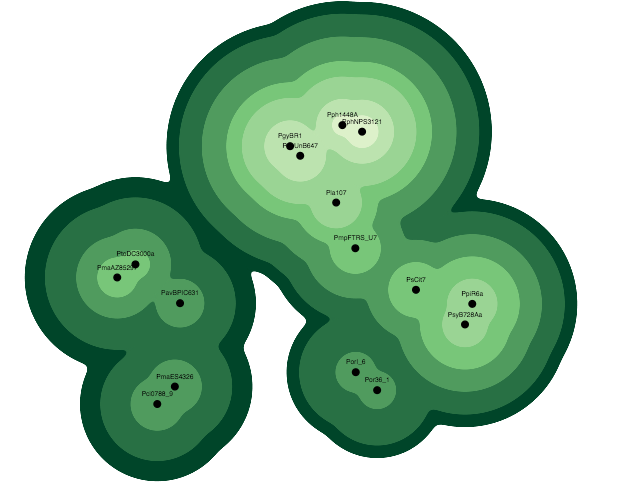
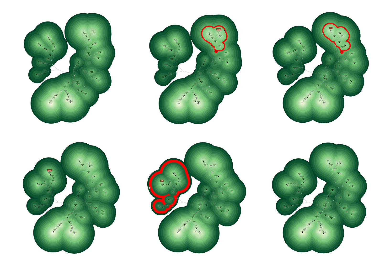
This tool visualizes each node of a phylogenetic tree as a point on a two-dimensional map, with the placement, surrounding color, and distance from other nodes determined by its attraction to parent and sister nodes, branch length, and hierarchical level. Topographic contour shapes indicate which level nodes are connected at. Gaps between clusters indicate clades from a different lineage.
The paper was published in PLOS ONE. Read it here.
Jamie Waese, Nicholas J. Provart, David S. Guttman. Topo-phylogeny: Visualizing evolutionary relationships on a topographic landscape. PLOS ONE. Published: May 1, 2017
Inspiration
This visualization paradigm is similar to Max Fürbringer's "Phylogenetic Tree of Birds" diagram, which shows groups of related items on slices of a hierarchical tree. This was published in 1888 in Untersuchungen zur Morphologie und Systematik der Vögel.
This image was published in Isabel Meirelles' Design for Information: An Introduction to the Histories, Theories, and Best Practices Behind Effective Information Visualizations .
The digital scan is from The Genealogical World of Phylogenetic Networks blog.
Early mockups
A hand-drawn mockup of a topographical representation of a phylogenetic tree.
I tried many approaches for building topographic maps based on phylogenetic data structures. Here is an attempt using HTML divs. It demonstrates hierarchical relationships well, but it is not space efficient.
My breakthrough came when I realized that each node could be drawn as a stack of circles, with the top circle in the stack containing the label and each circle below it sized and coloured according to its distance from the root and the cumulative branch length.
The finished product
Each family of genes highlighted in the phylogenetic tree on the left is also highlighted on the topographic map on the right.
